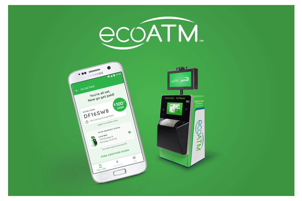
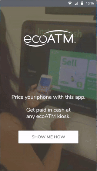
What is ecoATM?
ecoATM is a kiosk that pays instant cash for unwanted or used cell phones, tablets and MP3 players and recycles them responsibly.
Key Goal
To create a convenient mobile app experience that allows the user to get an accurate price offer, assist them with the necessary preparations, and allow them to 'Drop-off' their phone to get paid at the kiosk.
Problems to Solve
Users had to stand for several minutes at the kiosk to get an accurate price quote for their device, many people would eventually get impatient and walk away without even getting their offer.
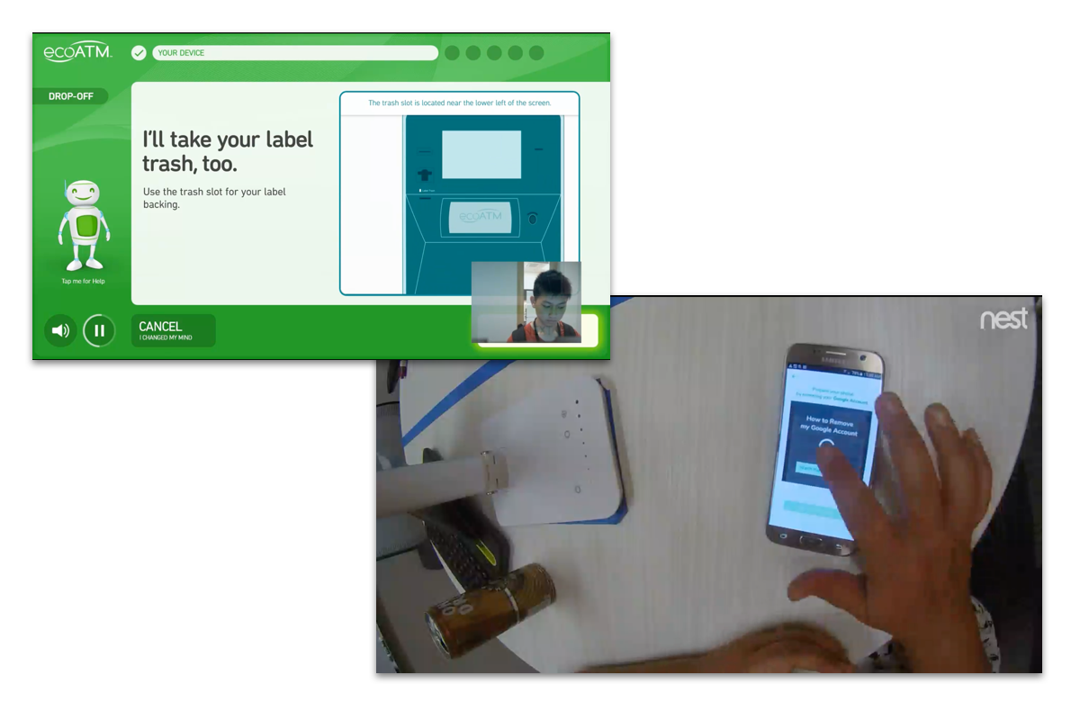
In order to sell their device, users had to remove their Google or iPhone Accounts, but the directions to do this at the kiosk were cumbersome and caused a great deal of friction for the users.
Users had to plug in their device with the appropriate cable in order to verify that their device was eligible for sale. However, the cables provided in the kiosk were becoming more worn and unreliable. In many instances, people could not get an offer solely because the cable did not function properly.
Role & Responsibilities
Discovery, Ideation, Interaction Design, Prototyping, Usability Testing, Visual Design, Documentation
Other team members included a UX Consultant, VP of Product, VP of Operations, VP of Engineering, 2 Front-End Developers, a second Sr. Interaction Designer who joined the team shortly after the project started.
Approach
I prefer to apply the 'Double Diamond" method in my design strategy where I use divergent and convergent thinking methodologies to first focus on "Understanding the Problem" of the challenge presented. Once the problem is understood and defined, I then focus on "Creating the Solution".
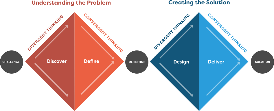
Understanding the Problem
Exploring the Problem as a Team
I gathered with stakeholders from UX, Product, Engineering and Operations to explore the problem, discuss the business viability, what was required and possible with the current system, and what challenges lied ahead with the user's value for the app.

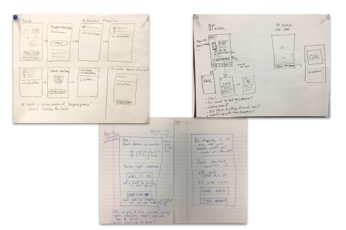
Sketching for a Common Vision
The team was then asked to quickly sketch multiple solutions and present what they would like to see. They were then asked to sketch and present a final possible solution. This helped align a common vision of what the experience should be.
Developing a Vision of the Product
The team then needed to figure out how a user would get from Point A (installing the app) to Point B (dropping the phone at the kiosk). By starting at Point B and going backwards, we were able to come up with a 'Vision Map' of the general steps that would have to occur.
I was then able to synthesize the Vision Map and the final Team Sketches to create and Interaction Framework that helped guide the rest of the process.
I was then able to synthesize the Vision Map and the final Team Sketches to create and Interaction Framework that helped guide the rest of the process.

Creating Prototypes for Real Users
I ended up creating two prototypes. The first was made with Invision. The second was created in Proto.io, which had input controls, UI components, and dynamic interactions.
Getting Feedback from Real Users
I created two separate testing environments to observe different aspects of the experience. The first was a room where the user could use the mobile app, the second had a kiosk where the user could complete the transaction.
There were multiple cameras in each environment and we had several stakeholders assist with recording observations onto Post-It notes in a separate room.
We ended up having two separate sessions. The first used the Invision prototype which helped give valuable insight into the users mental model and uncover a few blindspots from our initial design. After going back and iterating with our findings, we had a second session with the Proto.io prototype, which allowed us to then validate the experience.
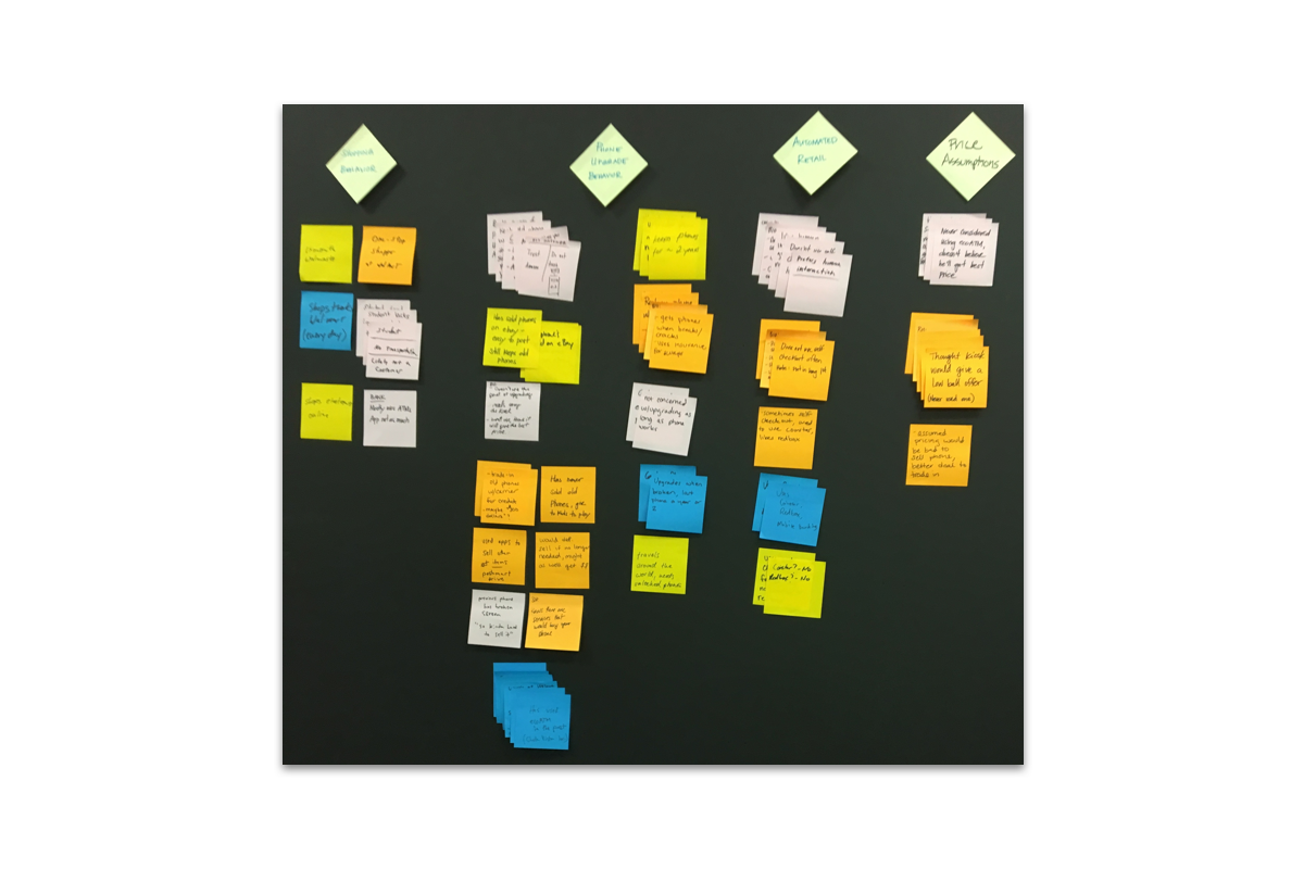
Synthesizing Observations into Insights
The observations from the usability sessions were then organized into themes, which were then synthesized into Insights and then reframed into 'How Might We' (HMW) questions that could be used for ideation.
Creating the Solution
Storyboarding the Entire Experience
We then created a detailed step by step storyboard of the entire experience from the user's point-of-view. Once again we started at the end, and worked backwards, placing our HMW questions (orange Post-Its) contextually within the story. This helped us understand when and how to address certain sticking points the users were having.
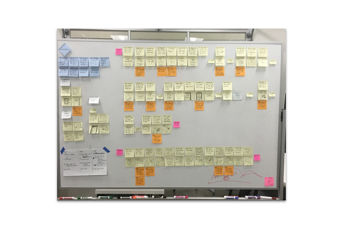
Ideating and Iterating Solutions
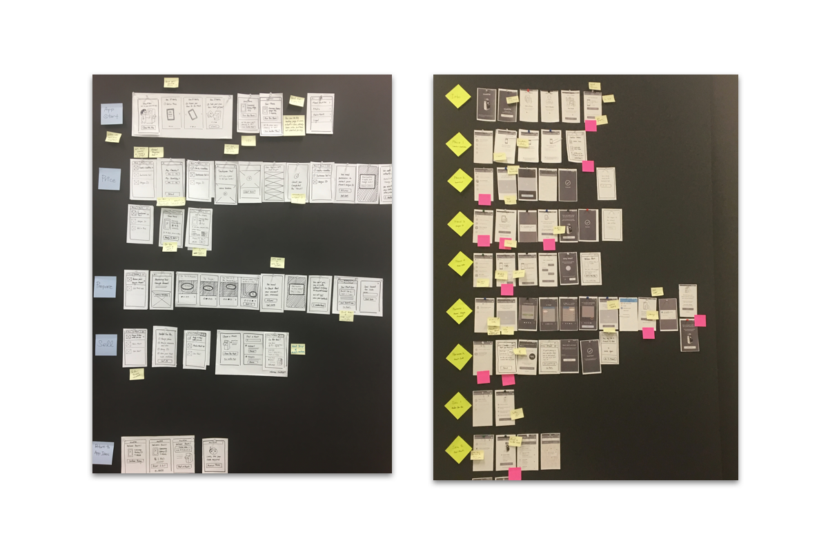
Once the storyboard was complete we sketched a quick wireframe representation that was the starting point of the final UI.
Executing Best Design Practices for Scale
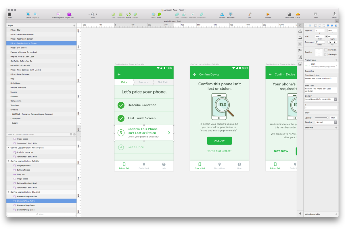
After the validation from the second usability session, I began working on the final visual design in Sketch. I created a design library that was influenced by 'Atomic Design' patterns which included typography, styles, elements, dynamic components, and resizable templates. The pages were organized by the interactions originally framed in the Interaction Framework.
Collaborating with Developers
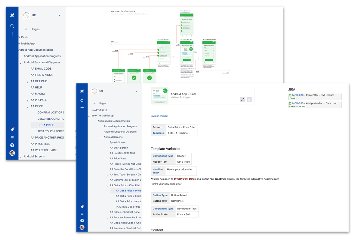
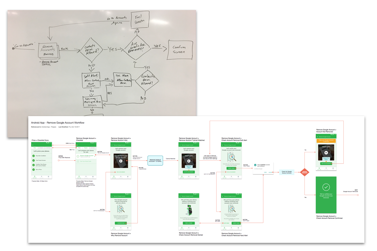
I then discussed the functionality and logic with engineering and documented them in Omnigraffle with the screens created in Sketch. The screens were then uploaded to Invision so they could be embedded into Confluence and linked to the Inspect feature for the specifications.
Creating a Single Source of Truth
Both the Screens and Functional Diagrams were documented in Confluence and attached to their respective JIra tickets for agile development. Each diagram was linked to their parent diagram and had a list of all the screens that were included, making it easy for the developers. They were also able to collaborate with me directly in the documentation if they had any questions. Confluence also provided a reliable source of versioning and logging activity for prosperity.